A picture of income disparity
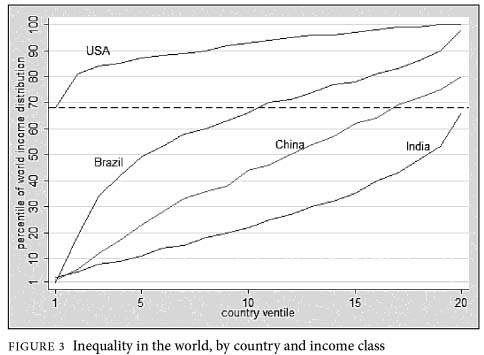
This chart was published in Mother Jones to make some point or another about the shame of income disparity in America. The chart is taken from a book titled “The Haves and the Have-Nots,” by the World Bank economist Branko Milanovic. I don’t know why Milanovic selected these countries and can only surmise it was because they were the three fastest growing major economies in the world over some recent time frame.
What the chart says to me is (1) the poorest group in the U.S. is infinitely better off than the poorest group in the other nations, (2) income disparity is the least in the U. S. This is apparent all along the scale from the most impoverished to the wealthiest as shown by the relative flatness of the U.S. curve, (3) whatever faults the American economic system may have, they are insignificant when compared to the other systems because every group is better off in America, particularly the lower income ones. Mother Jones picked a rose and called it a thorn.
China is a socialist country; India is not; Brazil is somewhere in between. Nevertheless, the chart is a good illustration of the superiority of an economic system that incentivizes individual entrepreneurialism and protects the rewards for success with a healthy respect for property rights. It’s a fact of life that equal treatment is bound to produce unequal results because people are not equal. The capitalistic system gets the best from the best; socialism does not. And if China can be taken as an example, socialism doesn’t reduce income disparity either.

